This portfolio piece showcases my visual identity design for Seoul Metro Station, drawing inspiration from the station's iconic triangular roof. I transformed the roof into a circular dome, symbolizing unity and continuity.
Over time, the dome has undergone repairs, resulting in multiple layers overlapping, creating a dynamic visual effect that reflects the station's rich history and architectural evolution.
This design concept captures the essence of Seoul Metro Station while offering a fresh and contemporary interpretation of its identity.
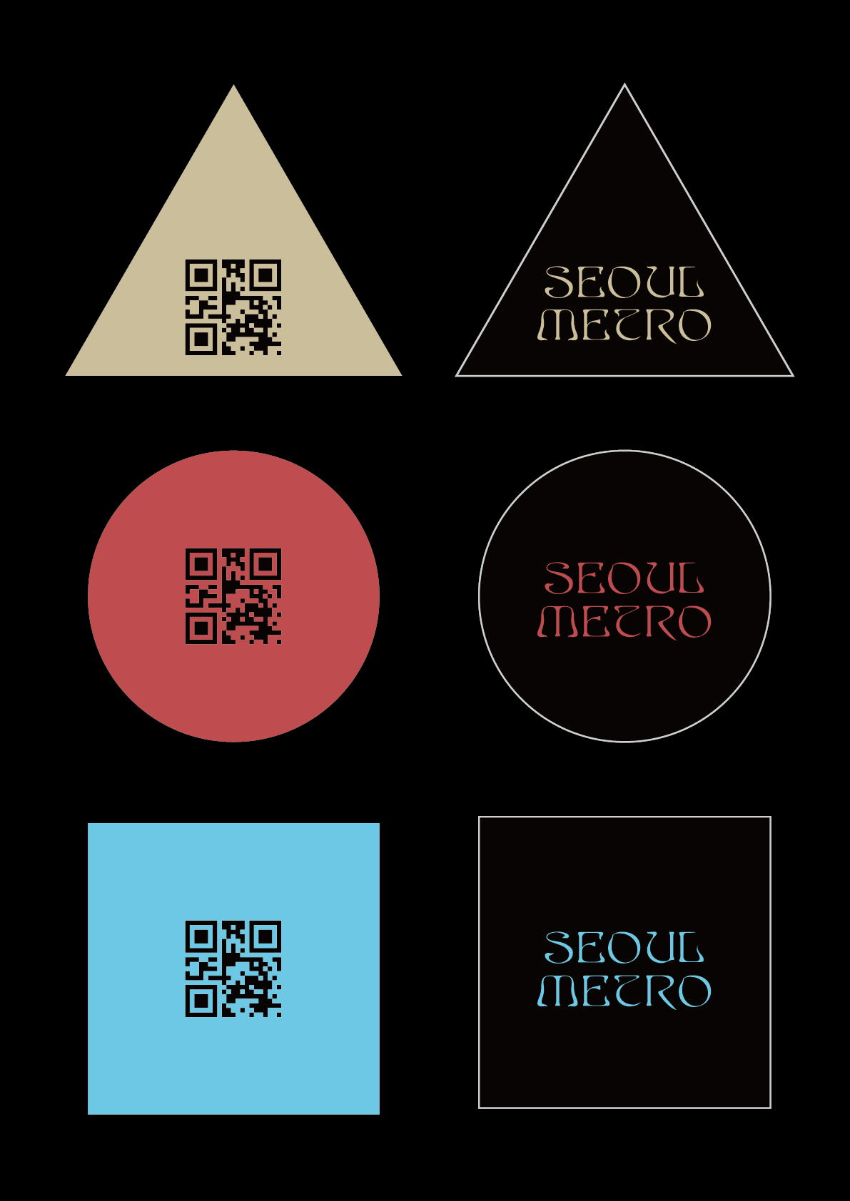
The three types of modules used in all designs—circle, triangle, and square—and the three colors—beige, sky blue, and crimson—are extremely simplified renditions derived from the shapes and colors of the building’s three renovation phases.
Additionally, considering Seoul Station’s iconic appeal as a destination for people of all ages, I adopted a sequence of simple forms that resonate universally without carrying any preconceived symbolism.
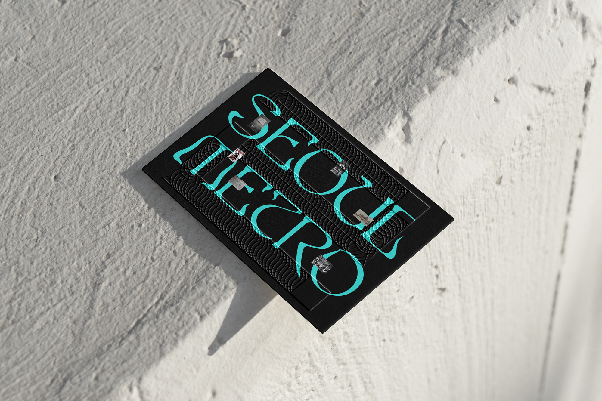
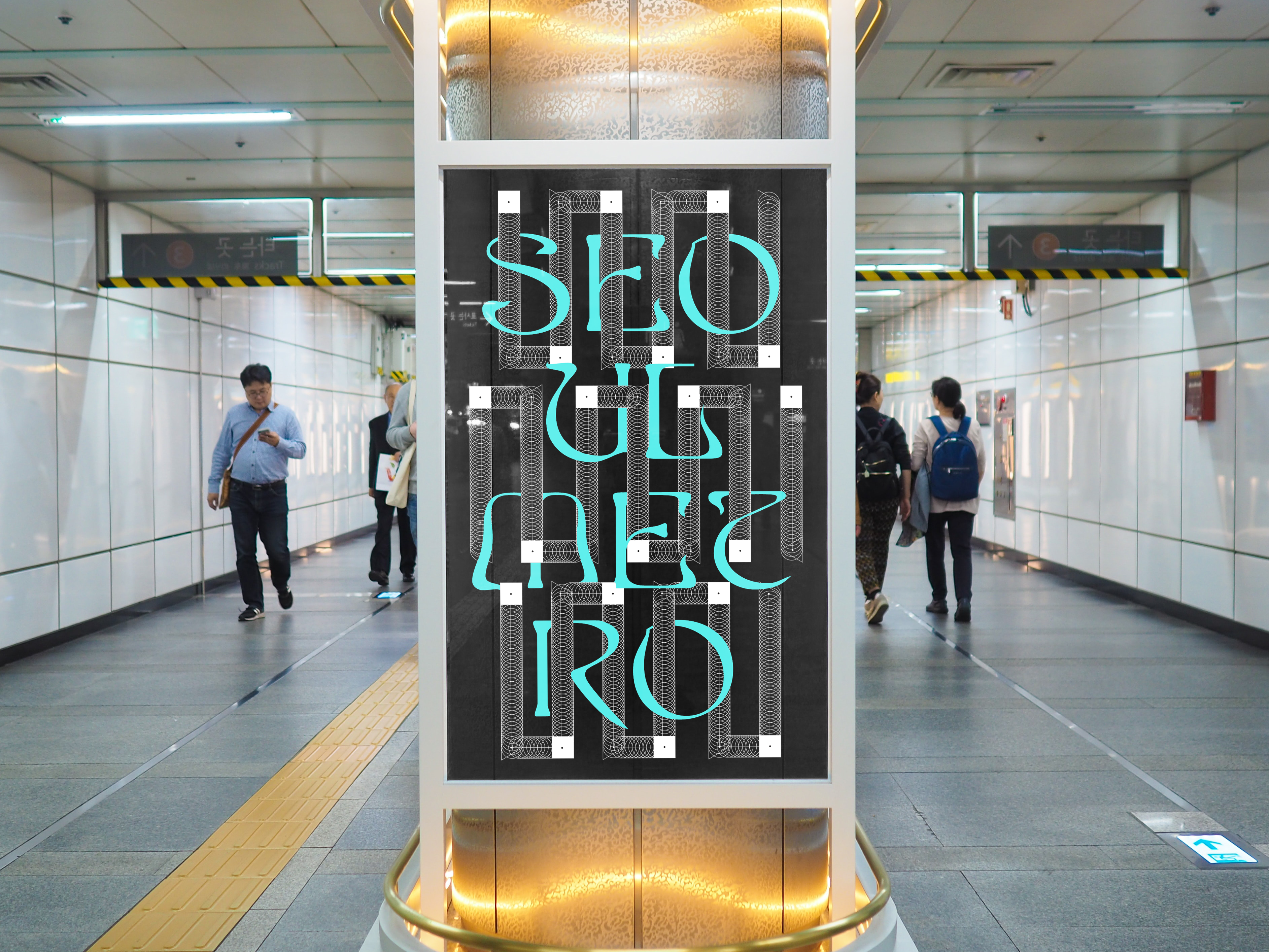
At the same time, I transformed and arranged these three modules in a way that evokes the familiar appearance of the subway.


The continuous sequence of circular graphics symbolizes the rails and wheels of the subway.
The fusion of vintage and contemporary typography represents the coexistence of modernity and history, echoing the subway's century-long legacy.
Through a combination of simple graphics, I created an attractive design that makes people love the subway—a transit system that has transcended its historical roots to thrive in the present.

This exhibition does not simply showcase the history of the railways passing through Seoul Station. Among the photographs documenting the interiors of the “역사” – a term that signifies both “station” and “history” in Korean – are images that capture the sentiments, trends, fashion, and tendencies of the people who frequented Seoul Station.
Over more than a hundred years, one can observe how people’s sense of aesthetics and levels of wealth have evolved. Yet, what remains unchanged is that Seoul Station has always been a public square where loved ones come together.
With the intent of conveying the beauty of enduring connections that persist despite the passage of time, I designed this pamphlet. The beautiful rail-inspired graphics, though appearing fragmented, are united by a sky-blue line. This geometric arrangement signifies “train” in Korean.